Home > Case Study - View-Master
View-Master
Re-imagining Reality (Global Launch)
When Mattel & Google announced their intention of combining forces to launch a reimagined View-Master, PowerStation was (naturally) very excited to be involved! This project combined a retro product with a 21st century twist and subsequently required a new brand ID, fresh packaging, POS and an informative-yet-stylish website to match. All of these had to communicate the immersive world which the new VR powered View-Master had to offer.
Using our signature creative flare, we got to work.
As with all of our projects, the teams first port of call was to delve deep into research. They knew that understanding View-Master’s legacy (since its original introduction in 1939), was very important in ensuring the success of this project. Multiple generations had grown up with the magic of View-Master and we were keen to see that trend continue into the future.
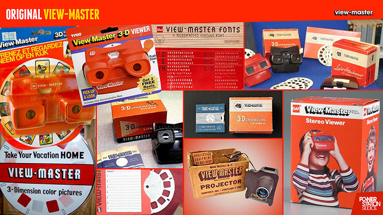
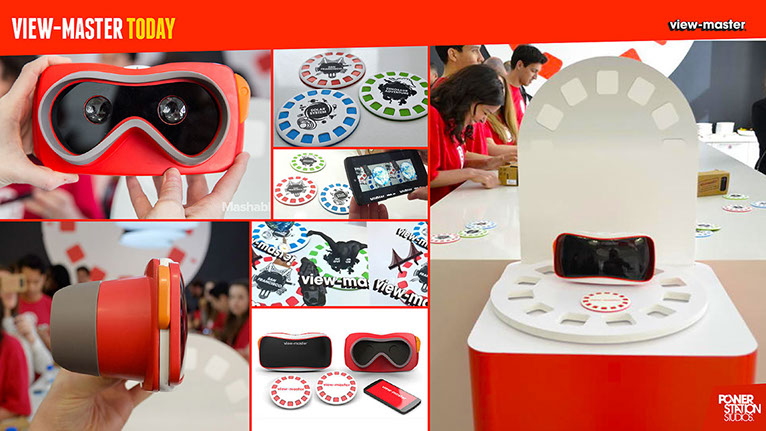
Mood boards were created to compare the contemporary View-Master with its original predecessor. Not only did these mood boards identify themes which had successfully passed the test of time, but also helped to establish the core building blocks of the brand.
Client:
- Mattel
Project Details:
- Reimagining the retro brand
Areas Covered:
- Website
- Brand ID
- Packaging
- POS
Packaging
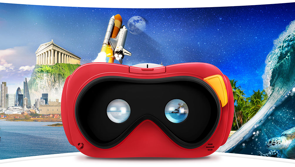
For the packaging, our main goal was to position the new View-Master in a way which would intrigue and entice its audience. The team made use of a single panoramic image wrapped around the box. This design encapsulated the spirit of discovery. It also helped generate awareness of the additional experiences available.

Above: The main packaging for the View-Master starter pack
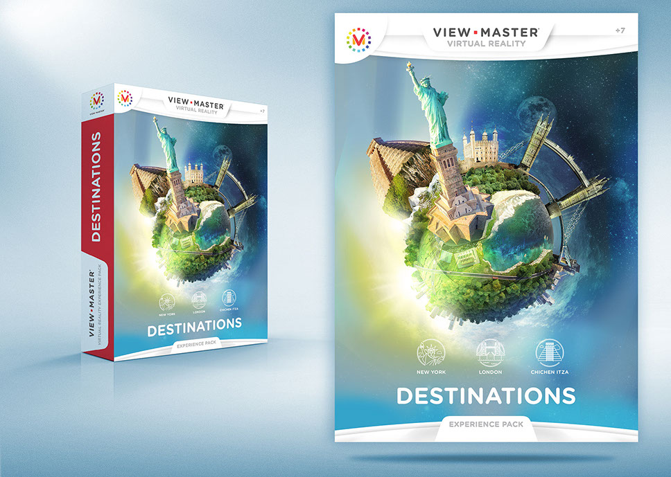
The View-Master launched with three optional experience packs; Destinations, National Geographic Wildlife and Space.
‘Destinations’ gave users the opportunity to take dynamic field trips to famous landmarks around the world (and watching its history come alive!). With ‘National Geographic Wildlife’, users could explore natural ecosystems and interact with animals in their natural habitat. ‘Space’ offered the chance to traverse the stars and experience space like never before.
"Although we knew the overall theme of each experience, [at the time] each packs specific focal points hadn’t yet been finalised. This meant that PowerStation had to create designs that were ambiguous enough to accommodate content flexibility, yet visually still reflects each individual VR world."
View-Master Lead Creative, PowerStation Studios
Fortunately, PowerStation found a workable creative solution. By creating a separate mini-world for each pack, the team could then execute a consistent stylistic direction across the product range. This option also allowed the team to add in key focal points at a later date.
POS
For the POS, we wanted to create a display that would encourage people to try out the new product first-hand. After exploring various options, we decided that a design which combined elements from both old and new would give the opportunity to pay homage to the View-Master legacy. As a result, picture reels (using the brand ID colours) were included. They also physically framed the product, which visually made the product to be the main focal point. As this was for commercial application, the idea was to encourage sales by triggering customer nostalgia and reaffirming their affinity towards the brand.

Above: View-Master interactive POS for retail applications
Website Landing page
For the website, our vision was simple - to convey the new View-Master as the must have toy for discovery, learning and awe. We wanted to bring back the magic that View-Master had given to so many by creating an immersive environment designed to inform and enthral.

Above: Preview of how the View-Master landing page looks on multiple devices
The site was visually led and made use of parallax scrolling & animations throughout. Its layout was designed with ease of use in mind (UI/UX) to ensure a positive visitor experience. The layout also provided an ideal platform for story-telling. As visitors scrolled through the site, it would take them on a journey through alternative worlds; providing a glimpse into the adventures that lay ahead.

Above: Mock-up of landing page background (image changes depending on site location and content being communicated)
Similar to the packaging, the immersive nature of each experience was visually reinforced by using a colourful panoramic image for the background. The background image would continuously change and transform according to where the user was located within the site. Aesthetically, this mirrored the information displayed on the page.
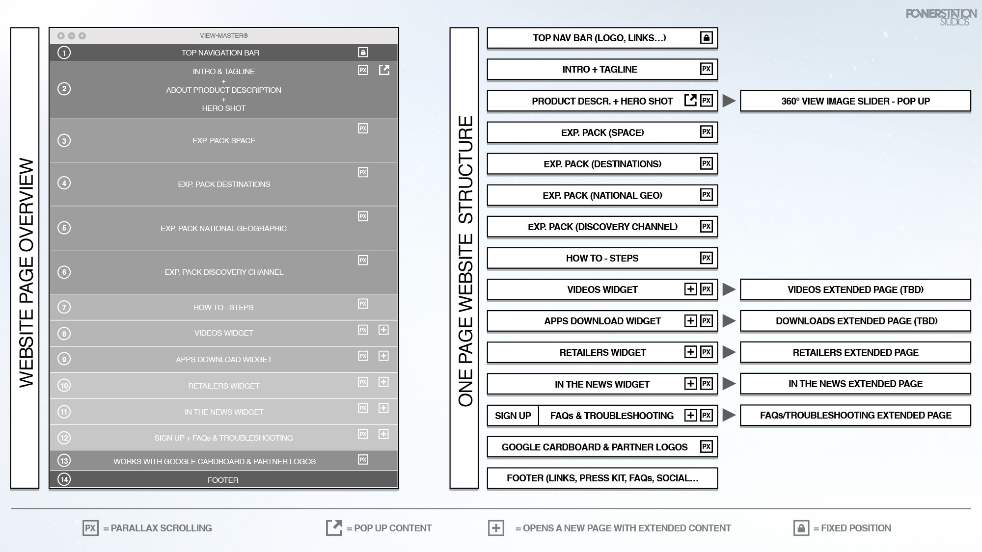
Above: Website design: Wireframing the site to establish best UX and UI for site visitors
The transition from location to location acted as a visual cue; encouraging visitors to continue their own journey of discovery to find out where they would be taken next.
In contrast, when it came to communicating the physical product itself, the team decided to make use of visual-hierarchies and white space. These techniques resulted in coaxing the visitors eye-line towards the understated beauty of the new View-Master design.
Throughout the site, View-Master's specific colour pallete was used to reinforce the core brand recognition. The outcome of combining all these creative elements was an mesmerizing site that felt both dynamic and fresh.
The Result
Using a combination of modern simplicity and allusive story-telling, PowerStation Studios managed to successfully encapsulate what a product like View-Master is all about; the sense of adventure and discovery into the unknown. With a total project deadline of just under three months (from product inception to delivery), Mattel were blown away with the results.
Whilst there’s always a challenge in finding the right balance between re-imagining a brand and still respecting its heritage, PowerStation once again managed to produce the results.
Challenge complete.
^ TOP


