Home > Case Study - Call of Duty
Call of Duty
Franchise development:
A journey from branding to retail
As a creative partner to Activision, PowerStation Studios was tasked to create an extensive range of creative deliverables for their Call of Duty franchise. Verified by Guinness World Records as the best-selling first-person shooter game series of all-time.
THE CHALLENGE: To communicate Call of Duty’s iconic DNA as a lifestyle brand; Transcend its individual game releases into a brand that extends beyond the skull, bombs & bullets we all know and love.
This included everything, from the franchise branding & logo through to future retail-orientated assets and style-guides. On top of the variety of work required from PowerStation, the challenge-factor was increased thanks to a limited access to new assets (relating to the [then] future direction of the game).
Fortunately, this wasn’t an issue for PowerStation, who are adept in adapting to “limited asset” scenarios just like this.
Client:
- Activision
Project Details:
- Branding the Franchise
- Style-guide to retail
Areas Covered:
- Style Guide
- Brand ID
- Research
- Retail
- Branding

OUR APPROACh
In order to truly understand Call of Duty’s explosive world, we set our creative team on an explorative mission to find out exactly to what Call of Duty owes its continued success.
Looking through the CoD history, the team gathered a mix of visual references, inspirations and influences from previous franchise installations and its range of brand extensions.
Whilst exploring the series’ evolution, we identified recurring themes and ideas which we knew would resonate strongly with its audiences, whilst paying homage to CoD’s iconic in-game moments.
Post-analysis of all research materials, four key artistic directions were pursued. Directions targeted multiple audiences with potential use across a variety of commercial applications. Each artistic style focused on different key elements found within the franchise.
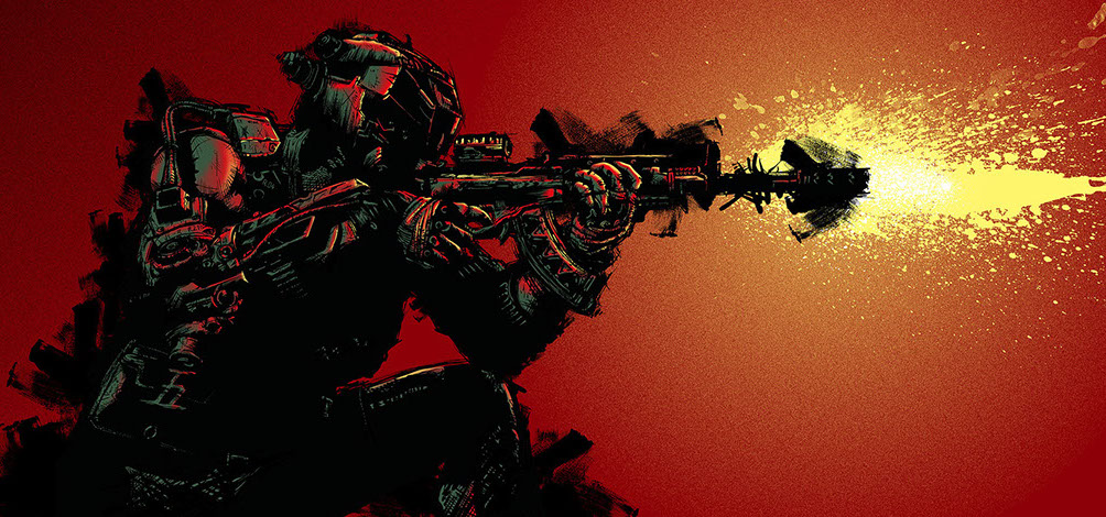
For our first direction, we wanted to pay tribute to the franchise with a series of cutting edge illustrations, showing the games different scenes, characters and situations in a dynamically explosive way.
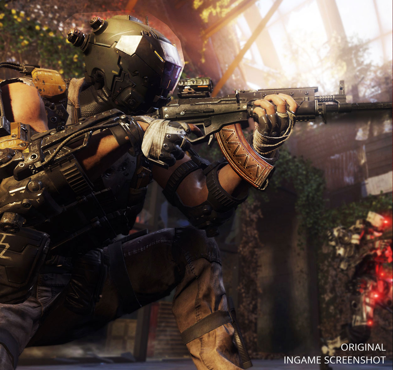
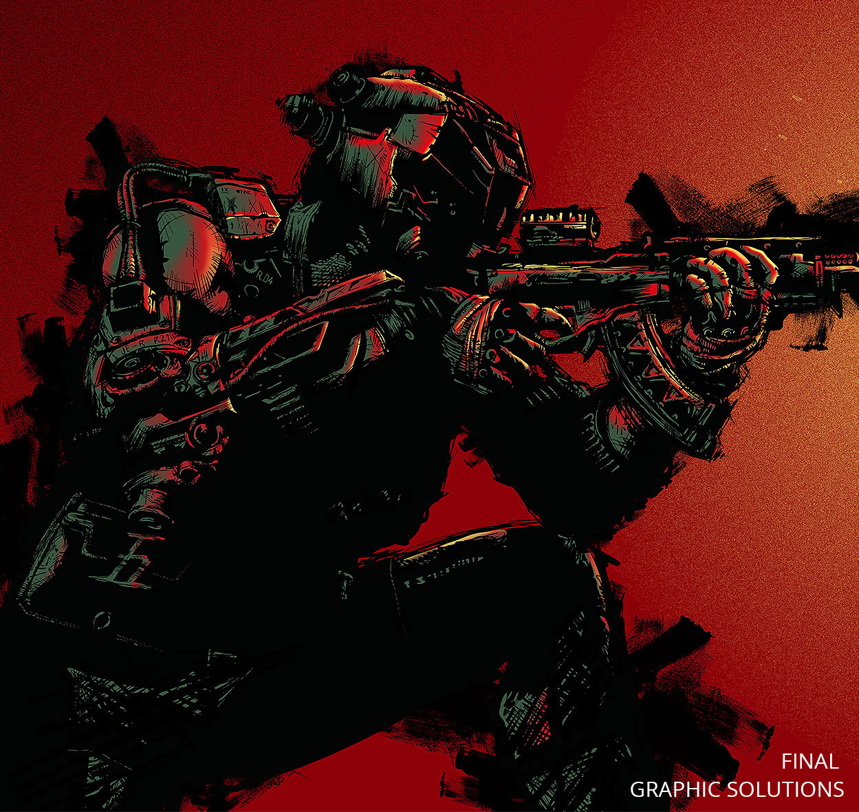
The combination of a limited colour palette and a sharp, clean pen-brushed illustration style results in an artwork direction that any fan would want to admire, own and - crucially - wear!
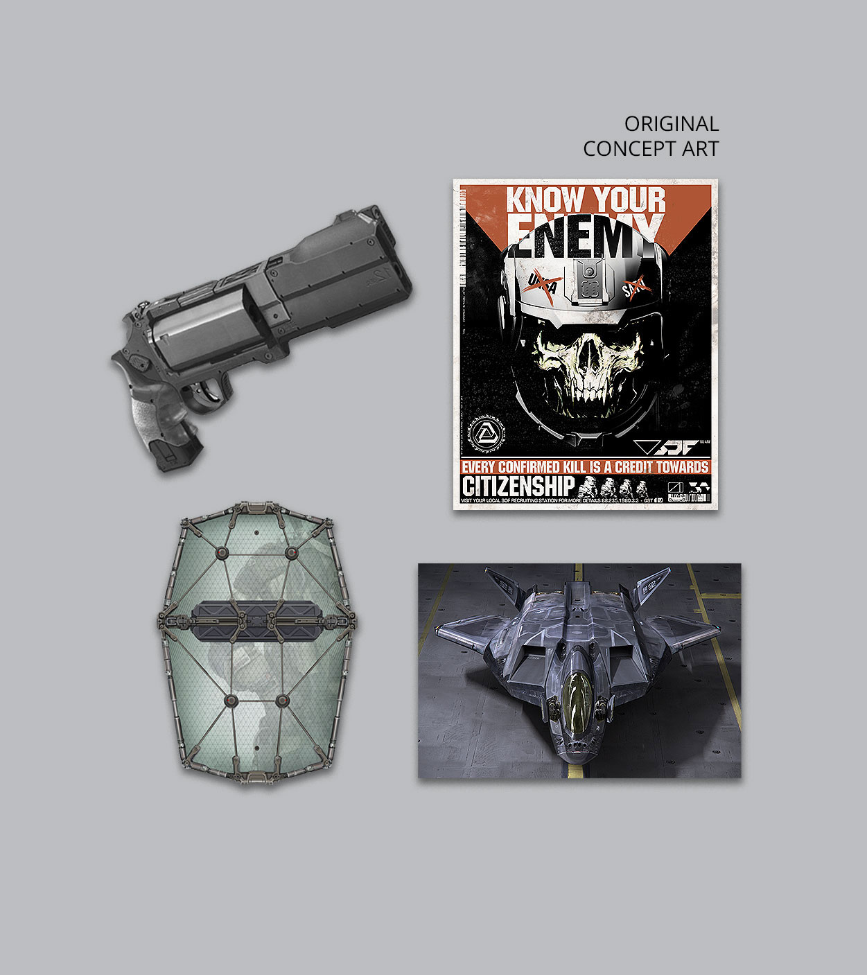
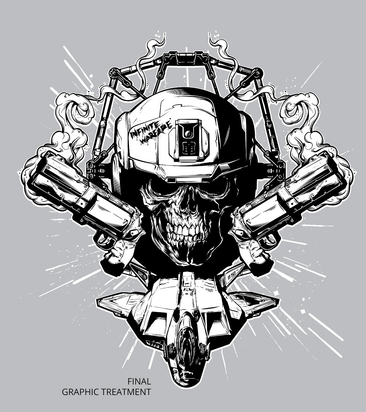
Our second direction, created complex graphics composed entirely from existing in-game assets. For this route, every element that built up each image was justified from our extensive research stage. These graphics - designed for use in creating extended product lines and apparel - utilised our layered discovery ethos of infusing designs with second or third read ‘Easter eggs’ for both casual and core in-the-know CoD fans alike.
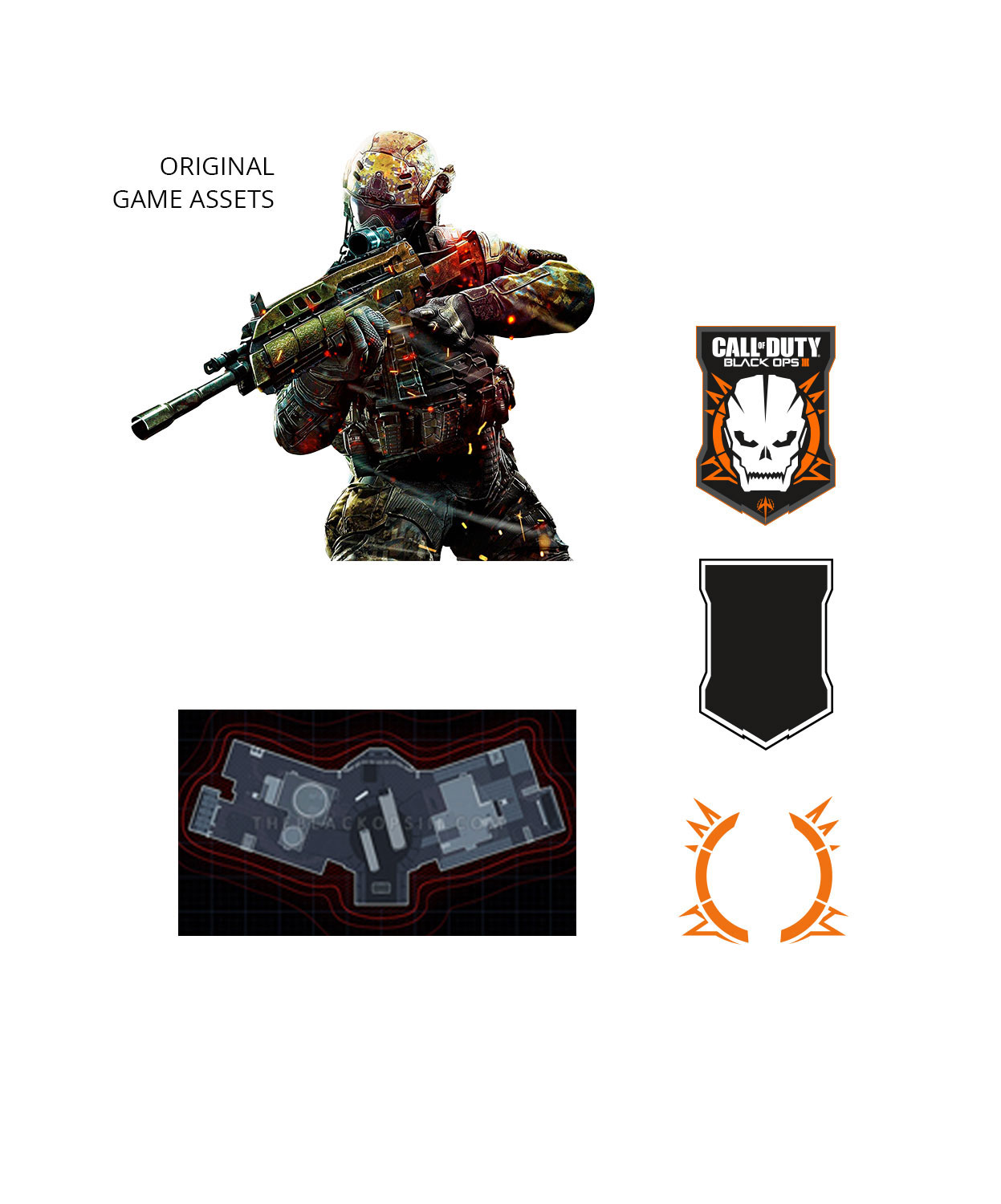
The third direction was conceptualised as a collection of several designs featuring the most popular maps and emblems in the franchise so far; a tip of the hat in recognition of the loyal CoD veterans who’ve supported the franchise over the years.


They could be used as designs on their own or as part of more complex patterns, referencing the game in a new smart way.
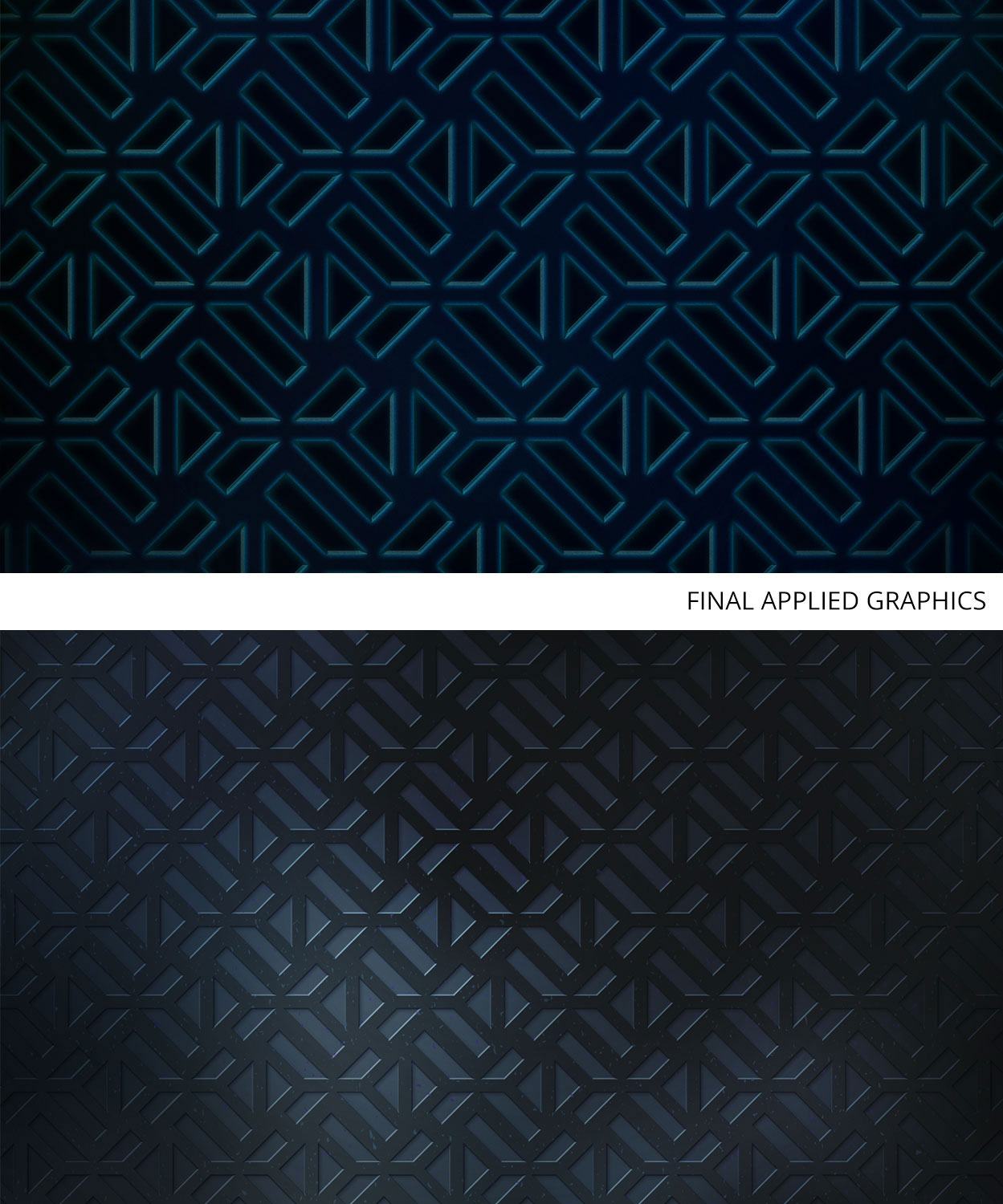
For our final asset collection, we created a range of textures, patterns and designs with an active lifestyle in mind - utilising high tech, military and sporting materials, fabrics and textures. These could be printed or developed using different materials such as runner, mesh and plastic moulding.

PROJECT SUMMARY
As one of the biggest franchises in gaming history, there’s huge pressure to deliver creative solutions which not only impress Activision internally, but also resonate strongly with the Call of Duty fan base; a challenge PowerStation took well within its stride.
After living and breathing the CoD brand, PowerStation creatives yielded outstanding results once again. We thoroughly enjoyed being part of this behemoth project and thanks to successfully delivering on-brief, PowerStation continues to be a key creative partner to Activision.
^ TOP