Home > Case Study - Bob The Builder
BOB THE BUILDER
Can we fix it? Yes we can!
PowerStation Studios remit was to create an all new core style guide in support of the Bob the Builder pre-school franchise relaunch.
The guide had to directly hit the key pre-school target demographic and incorporate an aspirational edge, to reflect the show’s new CG style that, strategically, would increase market appeal with a slightly older audience.
Quite literally drawing inspiration from new episode scripts, logos, older style guides, props, height charts and character art supplied by HiT Entertainment, the PowerStation team set to work.
We needed to create concepts which would not only satisfy the project requirements but also bring the brand in-line with today’s trends.
Client:
- HiT Entertainment
Project Details:
- Brand adaptation for retail
Areas Covered:
- Style Guide
- Illustration
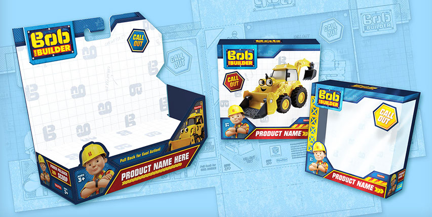
- Packaging
- POS

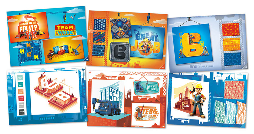
Above: A selection of some of the assets we were initially supplied with.
THE SOLUTION
PowerStation came up with three key graphic themes to work across all lines of the business franchise. This included packaging to consumer product, publishing to toy range.
Designs ranged from high tech blueprint styles to flat vector typography.
The first theme ‘BLUE TECH’ focused on the planning process involved in construction:
Every good builder works to a plan and Bob’s no stranger to a blueprint or two. Traditional is good, but modern times call for modern tech, so now Bob has his trusty tablet, placing him at the forefront of cutting-edge technology (with Leo’s help to use it, of course!).
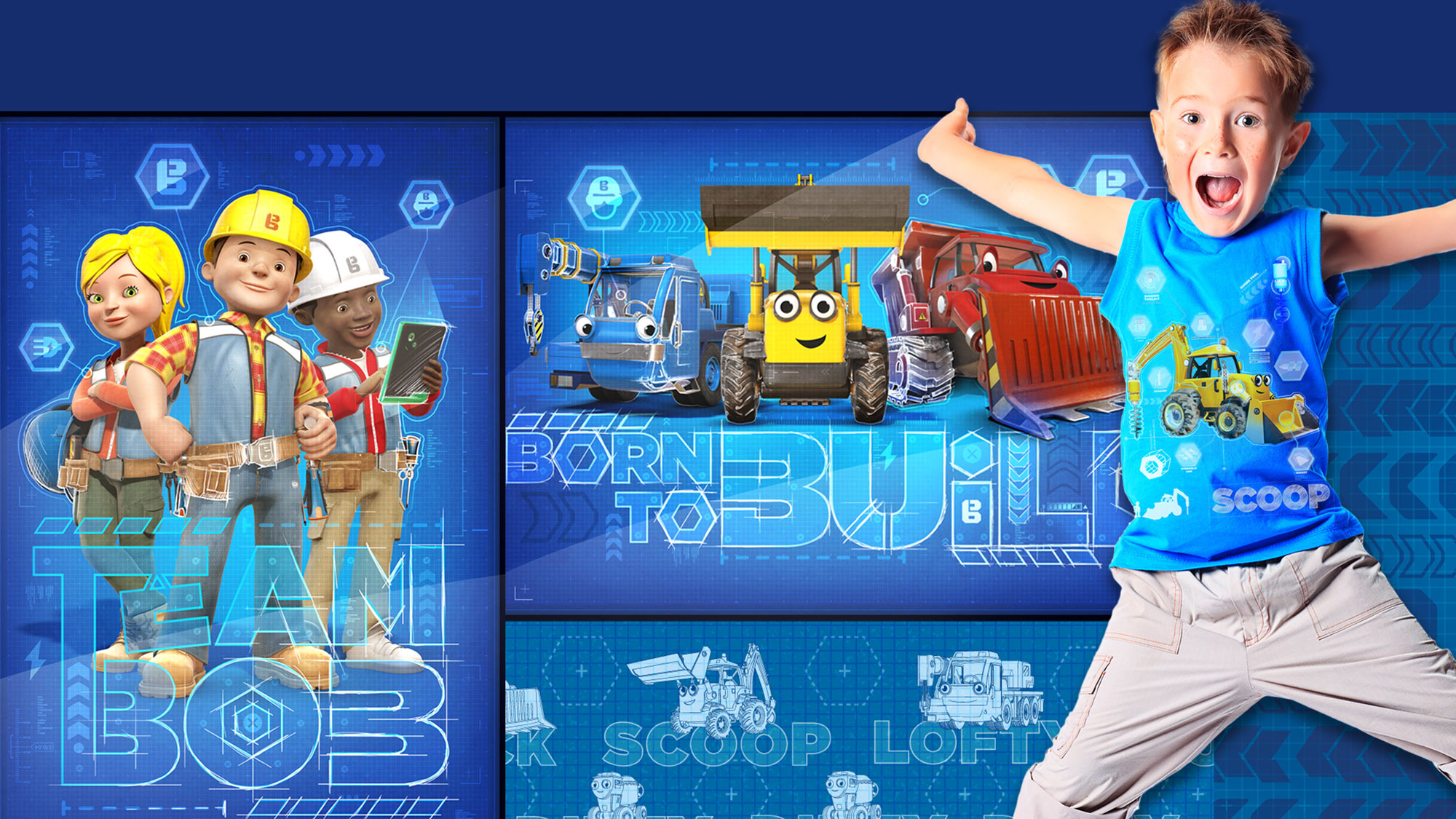
Above: Theme one: Blue Tech.
The second theme ‘BIG BUILD’ revolved around Bob’s ‘There’s no job too big’ attitude:
Mayor Madison has big plans for Spring City which means the sky’s the limit for Bob’s new builds. Industrious projects need industrial materials and thankfully Bob and his trusty team are more than ready to lift, dig, hoist, carry and construct their way to triumphant builds of epic proportions.
The team made sure that this thematic communicated the epic scale of construction by using chunky, industrial icons and font weights throughout.

Above: Theme two: Big Build.
The third theme was influenced by Bob’s story:
Every day is a busy day and every build has its own story to tell. But whether starting the smallest structure, or laying the foundations for the most complicated construction, a competent crew can make it all look so simple. Bob and the gang approach every grand design with positivity, energy and enthusiasm and at the end of the day, when the build is complete, he and his team always stand out!

Above: Theme three: Bob's Story.
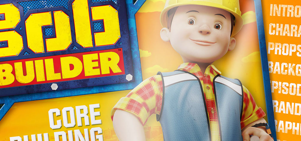
The final style guide reflected a culmination of all three themes which successfully achieved the desired aims of this project and provided a refreshing take on classic Bob. New PoS was created to help push the brand’s relaunch at retail. This helped promote the artistic style change to CG yet stayed true to the core personality & identity of the franchise.
A Marketing Toolkit was also provided to HiT Entertainment in time for the global launch to ensure client-side presentations were dynamic and on-brand.
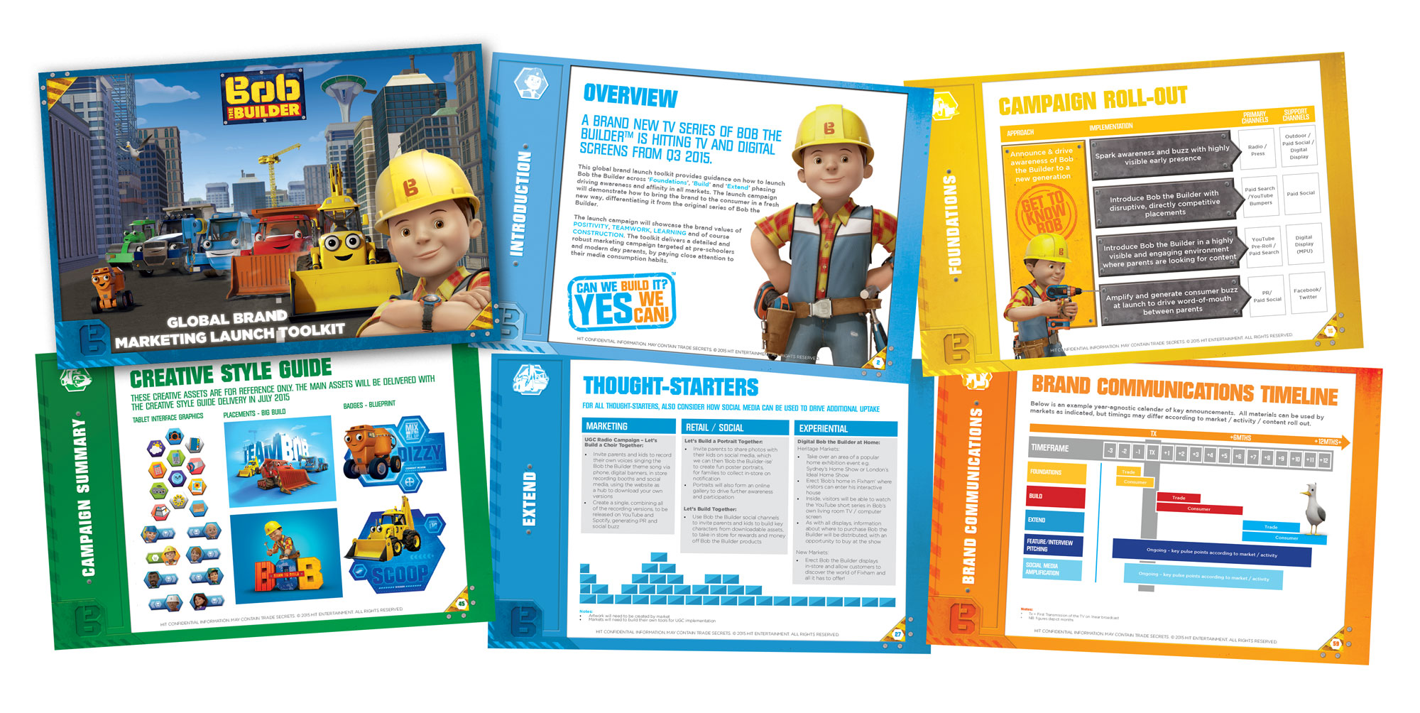
Above: Bob the Builder marketing tool-kit.
THE RESULT
HiT Entertainment approached PowerStation with the goal of achieving a successful brand transition to CG, effectively relaunching their highly popular Bob the Builder franchise.
PowerStation successfully reflected the persona and core identity of Bob and his team whilst communicating the new art style to the kids’ demographic.
The question we asked ourselves at the end? DID WE FIX IT?
YES, WE DID!
^ TOP


